
LOOKING to the skies - from sunny blue to rain-drenched and stormy - is the home decorating trick favoured by one of the world's leading stylists.
Art director Hans Blomquist has worked with major brands from Ikea to Harrods, Marks & Spencer, John Lewis and Zara Home.
He says the seasons and the changing colours of the landscape are his inspiration for winning interiors.
"It's easy to take colour for granted. We forget to appreciate the amazing, dazzling world that surrounds us, full of a million different shades that have the power to lift our spirits or soothe our mood," said Hans.
"Nature is my starting point for any project. For my job, I'm lucky enough to travel the world, and colour surprises me wherever I go - I'm often transfixed by the different colours and lights I've experienced in different parts of the globe.
"Most of my inspiration comes from the colours of the natural world. There is beauty to be found nearly everywhere you go and nature always inspires me with its wonderful colour combinations."
The easiest way to find your preferred colour palette is to take photos on your phone of whatever catches your eye, recommends Hans.
"Next time you leave your house, whether you're passing through familiar landscapes or visiting a different country, look around and marvel at the variety of colours that surround you. You'll end up with a collection of pictures which display a wide range of different colours and textures that will be a rich source of inspiration and help you refine your taste."
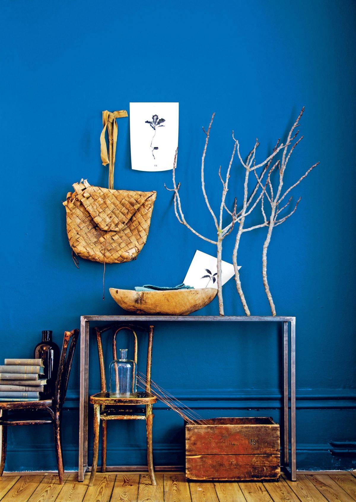
Hans loves to layer different shades of blue to achieve a harmonious interior with a sense of depth and calm. "I consider myself a 'blue' person. Painting walls a deep blue will give you a sense of summer all year round, and you can add warmth with natural objects and colours.
"Denim blue, greyish blue, duck-egg blue, shades of blue that veer towards green, and anything in between, are all favourites of mine.
"There's nothing more comfortable to wear than denim, and it's just as comfortable to live in a moody blue interior. Shades of denim can range from the deepest indigo to the palest, soft grey-blue."
Anything goes with deep moody blues. In an interior, dark blue works as a neutral and can look brilliant either covering walls or used as an accent in the form of textiles and decorative objects. Try layering different shades of blue from darkest navy to washed-out cornflower.
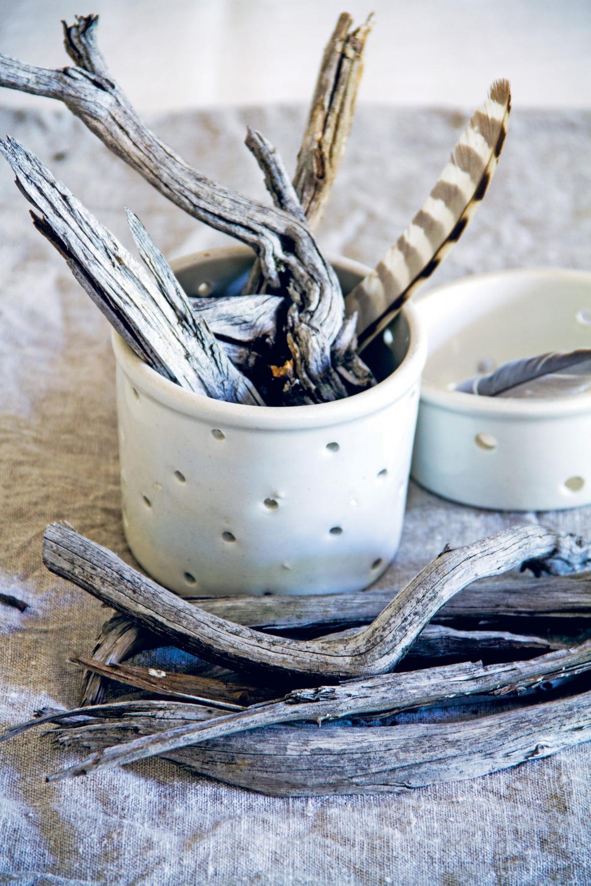
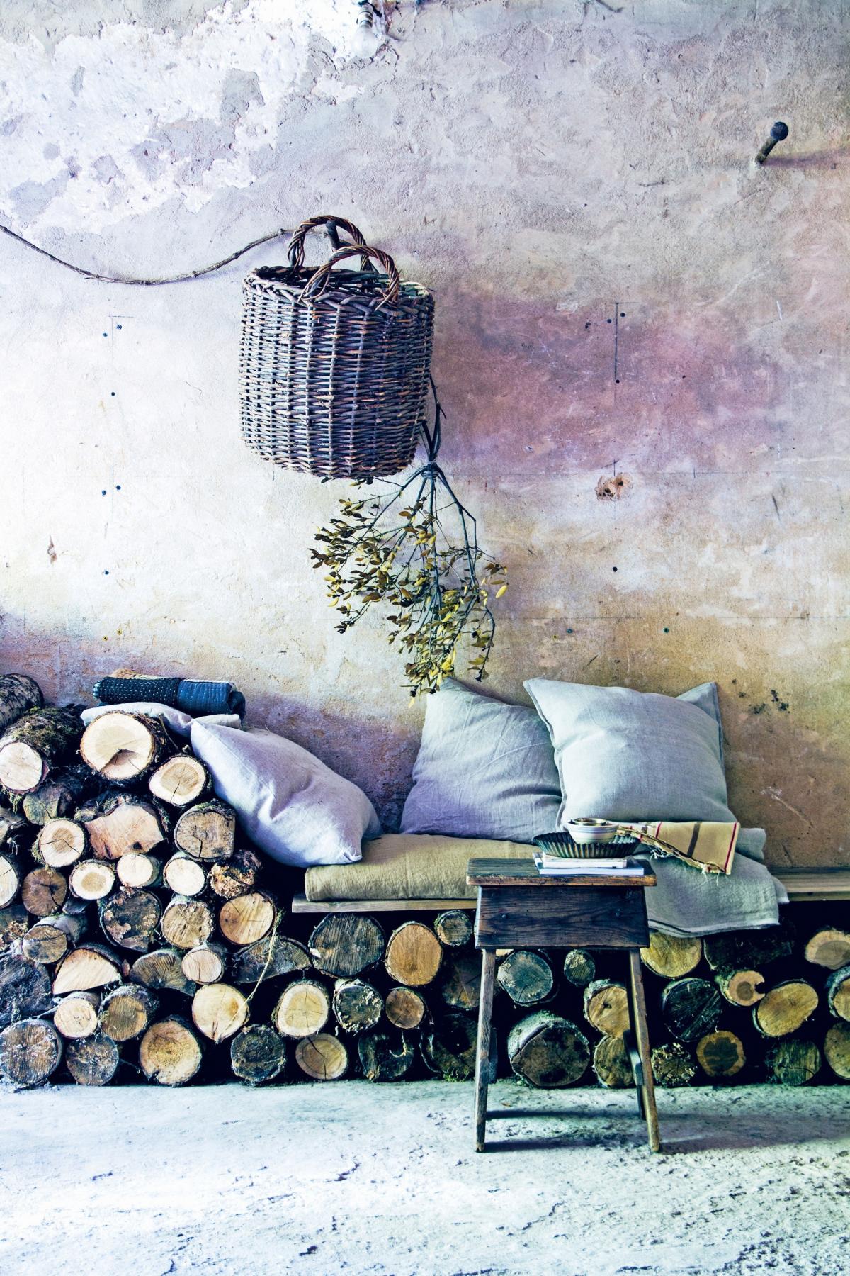
Natural colour schemes have a depth and softness to them, says Hans, and will make your home feel warm, inviting and relaxed. "I'm always collecting pieces of wood from the beach and the forest. I use some to light the fire, but the sculptural pieces usually end up on display and inspire me in my choice of colours.
"There's nothing like the faded colours of smooth driftwood, washed vintage French linen, or antique grey painted furniture. I love everything about these soft, warm tones.
"I like to mix vintage and new, textural wood playing off shiny porcelain, and if you feel the whole is too bland, introduce some greenery - a single leaf or a pot plant can be the last extra touch needed."
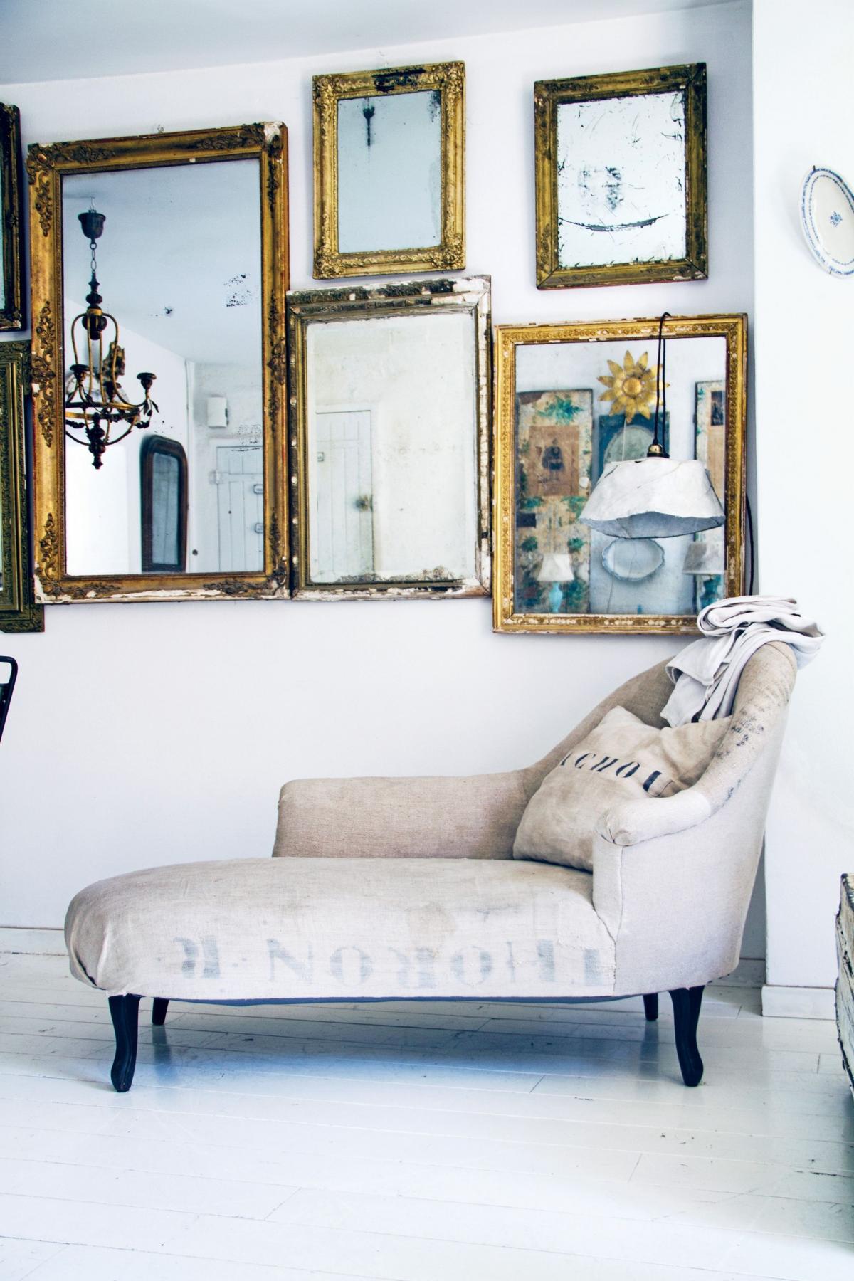
If you have plain white walls, add layers of texture and introduce different shades of soft white to make a room more inviting. A collection of vintage mirrors will reflect and accentuate any light in the room and is particularly effective in making a small space appear larger.
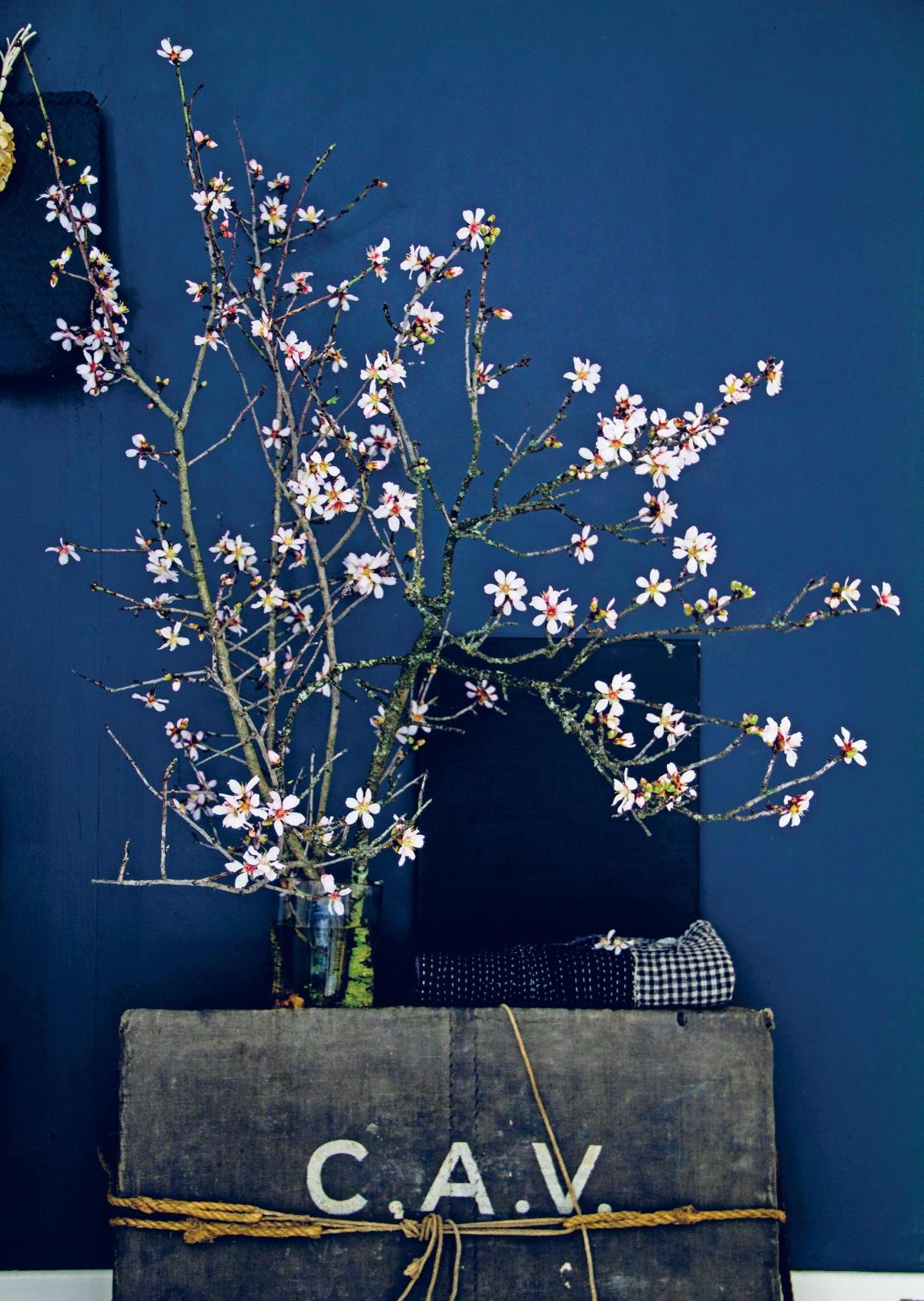
Towards the end of summer, vivid hues begin to fade and moodier colours appear along with dark stormy days and autumnal earthy colours; this is a palette Hans recommends for atmospheric rooms. "Even though I don't like rainy days, I love it when dark, thundery rain clouds roll in because their deep tones are astoundingly beautiful, and every other hue sits so well against them, especially the bright green of spring leaves.
"While you may be reluctant to repaint a room pitch black, I'm sure you would be pleasantly surprised if you did, as it's such a chic, comfortable colour to live with. I wish I had more dark colours in my home.
"A dark backdrop can have such an impact and create a sense of drama, yet at the same time give a very calm and cocooning feeling. It also makes any other colour stand out beautifully, whether it's a single flower, a branch of spring blossoms, or a piece of furniture."
If painting a whole room seems too much, start with one wall or ceiling. Create a tonal wall by painting one solid colour of matt paint in a dark colour and then, using a sponge, apply a wash of diluted lighter paint over it. Repeat until you get the desired effect. Choose from deepest indigo, inky black, thunder grey and earthy brown shades. Down Pipe, Railings and Pitch Black, Farrow & Ball (£43.50 for 2.5L; www.farrow-ball.com) are all worth a try.
- In The Mood For Colour by Hans Blomquist is published by Ryland Peters & Small, priced £19.99.


Comments: Our rules
We want our comments to be a lively and valuable part of our community - a place where readers can debate and engage with the most important local issues. The ability to comment on our stories is a privilege, not a right, however, and that privilege may be withdrawn if it is abused or misused.
Please report any comments that break our rules.
Read the rules hereLast Updated:
Report this comment Cancel