

ICE cream shades are the smart choice for decor this summer, but don't be put off by thinking that means a super-sweet, kiddie look, writes Gabrielle Fagan.
Far from sickly, this season's pastels are ultra-cool. Small scoops of these retro-feel shades - pink, mint or peach are particularly popular - used sparingly for accessories and furnishings are the way to tap into the trend.
If it all feels a bit too sugary for your liking, you can simply tone the look down with another gelato-inspired shade - classic whipped white - for walls or other furnishings.
"Pastels are one of the dominant colour trends this year. These hues bring a sense of calm and freshness to the home in preparation for spring/summer," said Jemma Dayman, a buyer at Carpetright.
"If you want to give your setting a seasonal refresh, centre the decor of a room on a pastel tone. I'd suggest a carpet in pink or mint green, as these colours are currently very on-trend.
"The shades also perfectly partner furniture with a minimalist design. On the other hand, if you just want a spoonful of colour from the palette, add a rug in a pastel shade for a subtle touch."
Take your pick from one of these three mouth-watering choices...
1. Add a scoop of strawberry pink
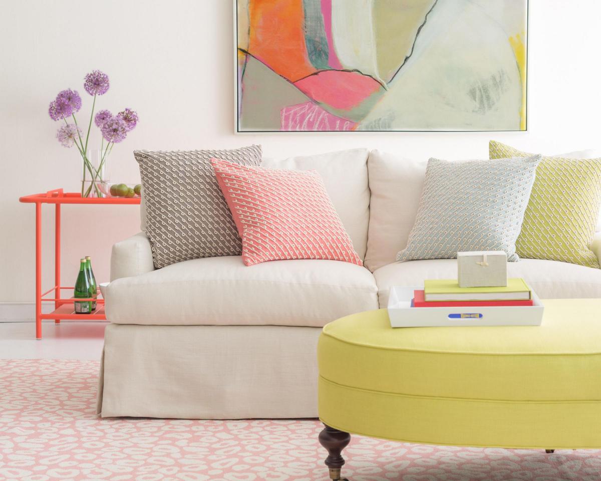
"Incorporating pastel hues into the home will help create a room that's an oasis of serenity, in which you can relax and unwind," said Emily Dunstan, a home buyer at Heal's.
"Touches of blush pink and sky blue gently lift a neutral colour scheme. Keep accessories to a minimum, and streamline the palette using silver and white finishes to achieve a clean, harmonious aesthetic."
Emily added: "Introduce a peaceful sense of nature in different spaces by filling tall vases with fresh botanicals to heighten the feeling of an organically inspired calm, and combine cool marble with rich woody tones to further enhance the organic qualities within the decor.
"Complete the scene by replacing harsh spotlights with delicate glass pendants and soft candlelight."
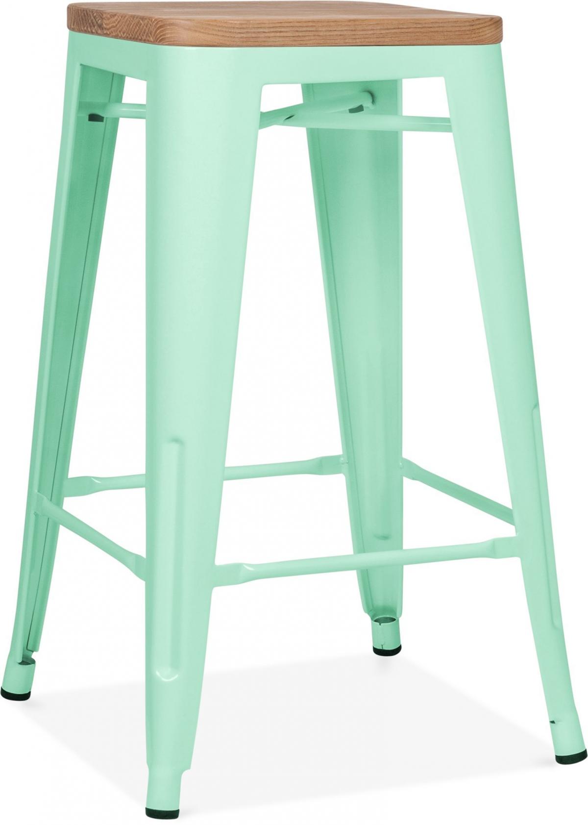
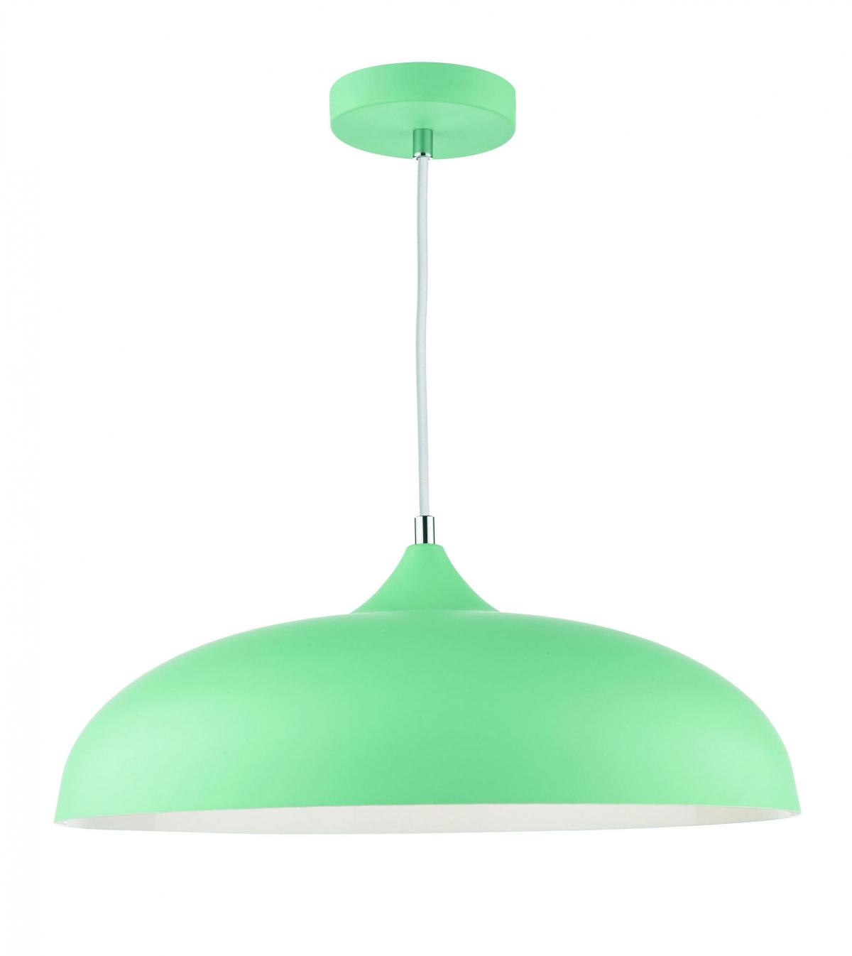
2. Make a space minty-fresh
"Using pastels in the home doesn't always have to be sweet and pretty," said Judy Smith, a colour consultant at Crown Paints.
"Shades of watery mint-green, the palest pink, or even sharp sherbet lemon can look new and modern if combined with tones of grey and hard materials like concrete and metal.
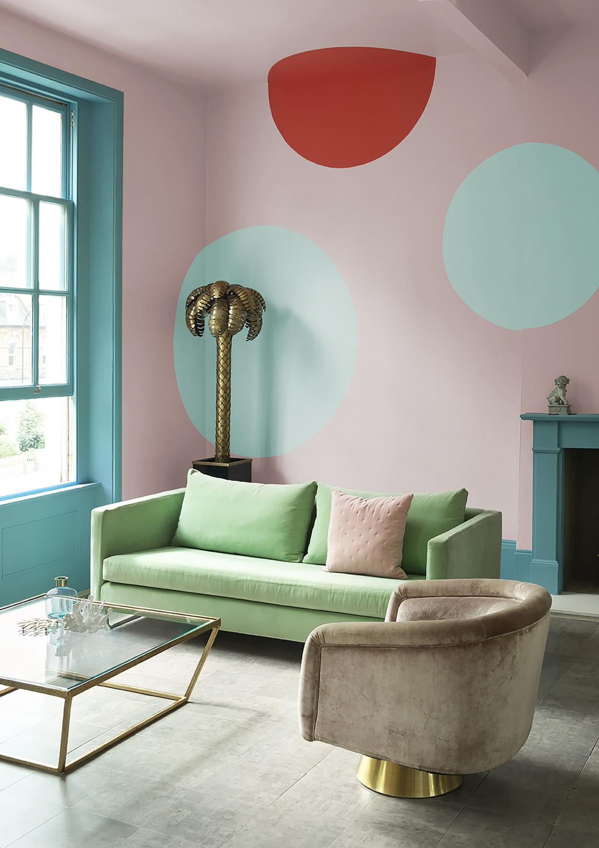
"Also, think about painting out a section of a wall in a strong asymmetric pattern that will bring an unexpected element to these soft and chalky colours."
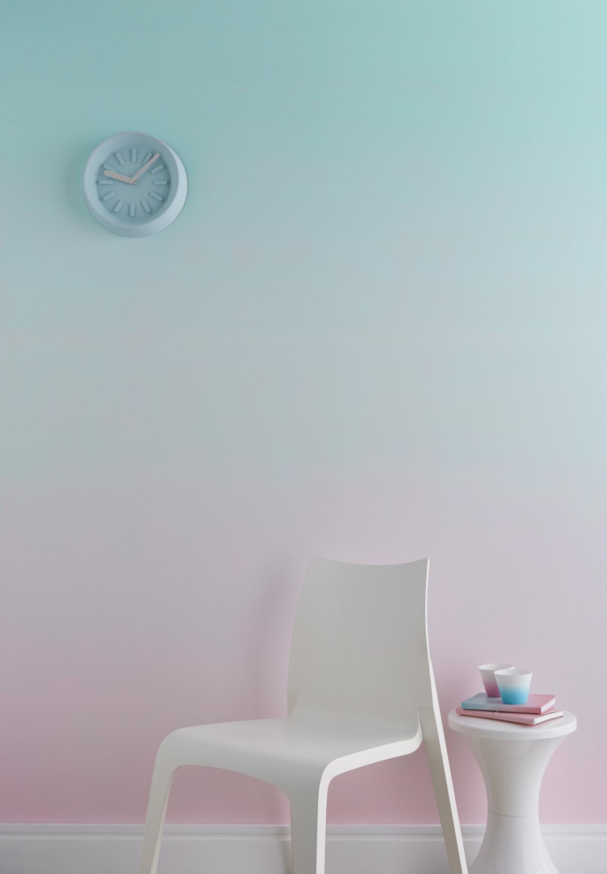
Another fun and effective way to use these shades, since they blend so beautifully, is to create an "ombré" (French for "shaded") wall. While this graduated effect might look like something only a professional can achieve, Judy says it is possible to attempt it yourself.
Tempted to give it a try? "Start by painting the whole wall in your top colour and allow this to dry. Mark a line dividing out the lower half of the wall in pencil," explains Judy.
"Once this is done, paint this half with your second pastel shade. Allow time for this to dry. Use a separate board or palette to mix the two colours evenly. Apply this mixed paint to the section of the wall where the two colours meet. To finish, use a clean roller across the middle section to soften the lines and create the blurred, gradient look."
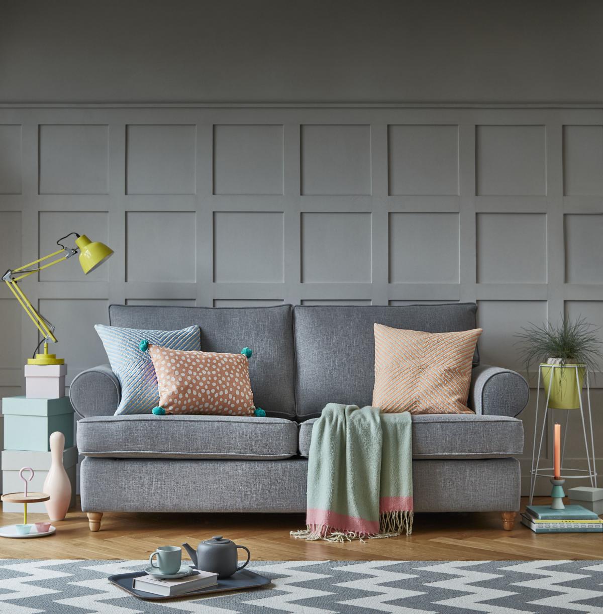
3. Pick a peach of a colour
"Peach is perfect for adding warmth to a space and is popping up all over the interiors world, eclipsing Millennial Pink, its duskier and more muted cousin," said Nadia McCowan Hill, style advisor for interiors brand Wayfair.
"For a retro-glam take on this hot new colour story, pair your peachy picks with gold and brass furniture and lighting. If you're looking for a contemporary approach, plump for geometric prints or colour-clash with forest green and emerald green, two other hot hues for the season."
Alternatively, a sofa in a neutral fabric - such as Willow & Hall's Buttermere sofa bed in country linen zinc - could be a focal point around which you display pastel touches. It's time to play with these pretty shades.


Comments: Our rules
We want our comments to be a lively and valuable part of our community - a place where readers can debate and engage with the most important local issues. The ability to comment on our stories is a privilege, not a right, however, and that privilege may be withdrawn if it is abused or misused.
Please report any comments that break our rules.
Read the rules here