


COLOUR-phobic and clinging to neutrals like a comfort blanket? Gabrielle Fagan discovers how to fight fear and brave bold decoration at home.
COLOUR is officially cool, according to the decor experts, but it takes a little courage to plunge into the palette and experiment in rooms.
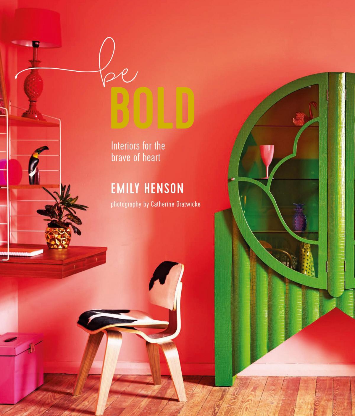
Banish the fear and do it anyway, declares Emily Henson, interiors stylist and author of the aptly named Be Bold: Interiors for the Brave of Heart, which is a celebration of homes with “joyful patterns, gutsy colour choices and exhilarating paint treatments”.
Their owners, she says, enjoy homes which contain daring explosions of colour, pattern, humour and originality, where “boldness is a way of life”.
Some make a statement “with vivid paint on every surface and neon signs on the walls”, while others have “leopard print and folksy embroidered cushions clashing on a pink sofa, or window frames painted yellow in an otherwise white wall”. Whatever, she notes, bold really is beautiful.
It’s certainly a world away from the bland, and Emily gleefully sums up the philosophy as “decorate like nobody’s watching”.
Still nervous? “Think of the colours you like and want in your life, and test the waters by spray-painting something small,” she says. For the more confident, she urges: “Dive in at the deep end, just go for it! What’s the worst thing that can happen? You won’t like it and you’ll have to repaint. That’s not the end of the world.”
Be inspired by these ideas from three homes where owners truly dance to their own decor tune...
Cook up a colour storm
Set designer Amy Exton indulged her love of colour and kitsch with a no-holds-barred scheme for her kitchen, and has created a home that packs a stylish punch.
“Amy hand-painted an eye-popping mural herself, painstakingly taping off each area and alternating between stripes, leopard and solid painted sections,” said Emily.
“She continued the mouthwatering colour scheme with apple green on the walls and brightly-coloured metal stools. It’s a total transformation from its previous look of magnolia paint and wall-to-wall brown carpet.”
EMILY’S DECOR TIP: Choose one shade and paint everything - walls, ceilings, doors, woodwork, radiators - for an intoxicating, enveloping effect. If that’s too much, choose a main colour for the walls and ceiling and one or two accents for doors, shelves or features. If you feel bold, paint part-way up the walls and leave the top half white, or use two different colours for a wall - in either complementary or contrasting shades.
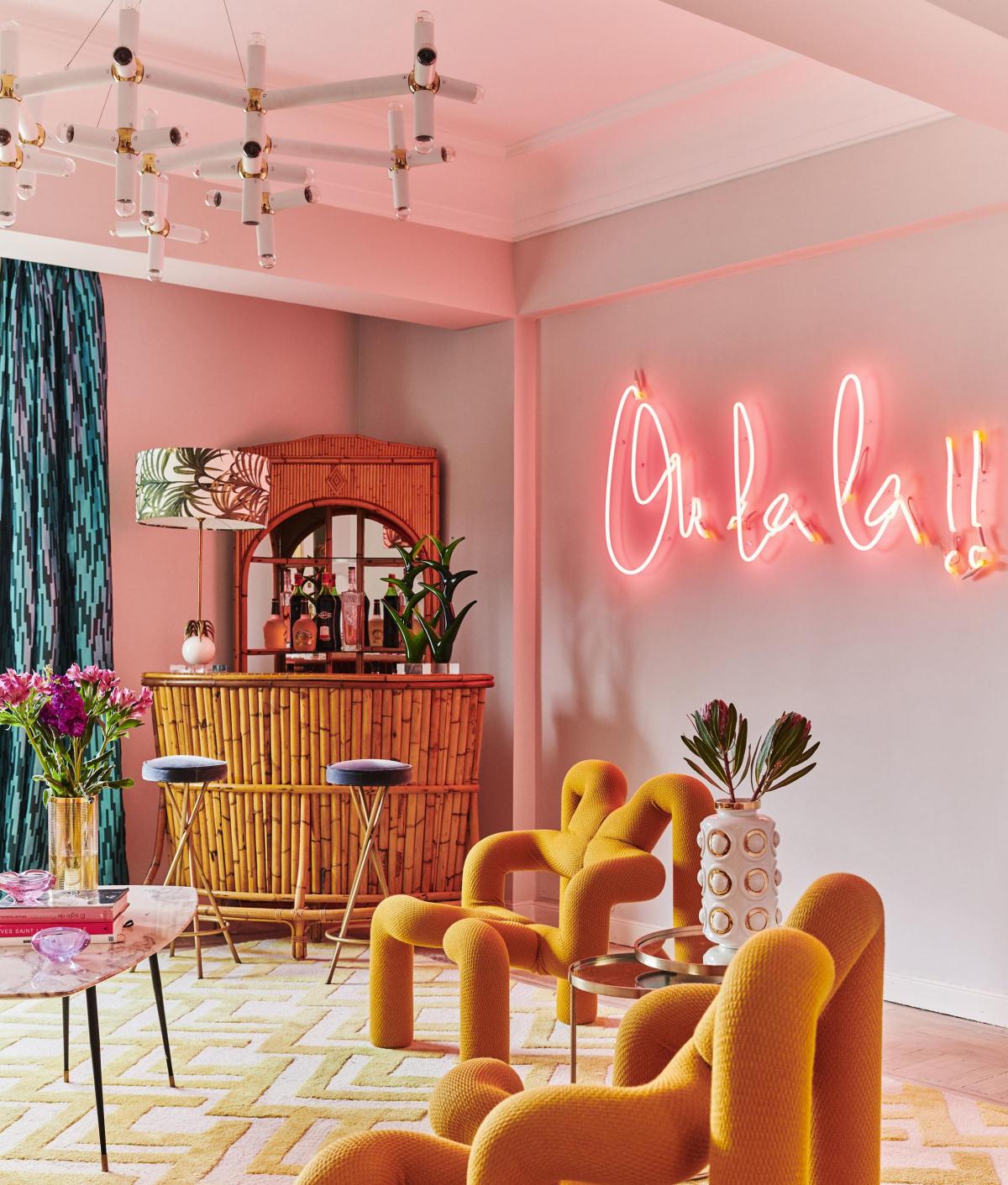
Mix a cocktail of shades
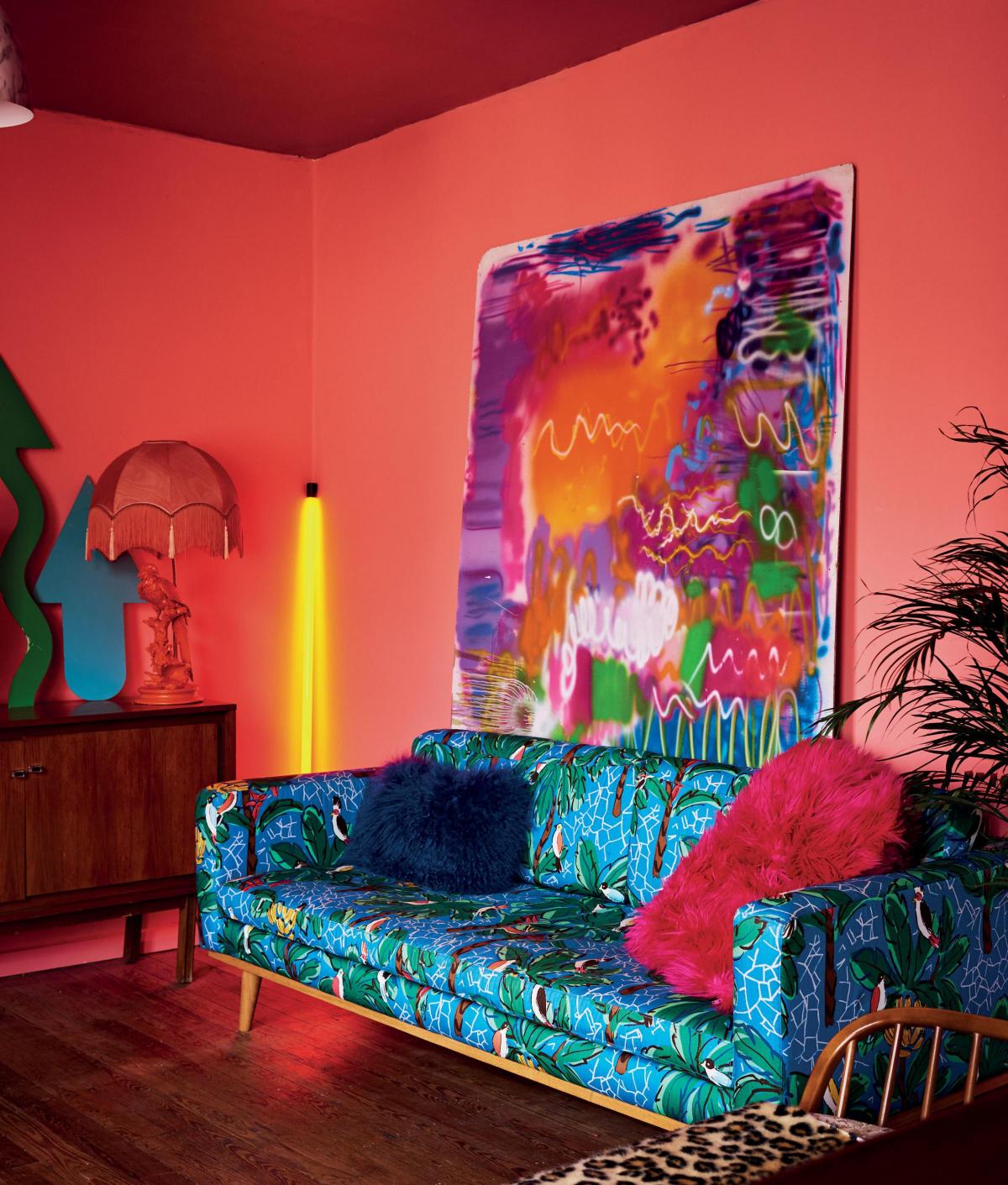
Anything goes in the apartment of Spanish designer Patricia Bustos who ignores outdated rules and injects a fresh quirkiness into all her schemes.
She’s created an entertainment zone with a bamboo tiki bar, 1980s Terje Ekstrom chairs upholstered in mustard wool, and for the perfect finishing touch designed her own ‘Oh La La’ neon sign.
“For Patricia, being bold means combining different eras, ignoring outdated rules about pattern and colour matching, and injecting humour and quirkiness into everything she designs,” said Emily.
“Her home is a joyful expression of what’s in her head, and it’s fabulous,” said Emily.
“It’s all fabulously OTT.
“What makes it work? A limited colour palette and the guts to own the look.”
EMILY’S DECOR TIP: Stylists often create ‘fake walls’ - large pieces of plywood covered in wallpaper - for photographic shoots.
These can be used as a flexible, movable expanse of pattern, which can be leaned against a wall for a playful focal point, or used as a great way to test out your enthusiasm for a particular pattern or colour, before finally committing to it.
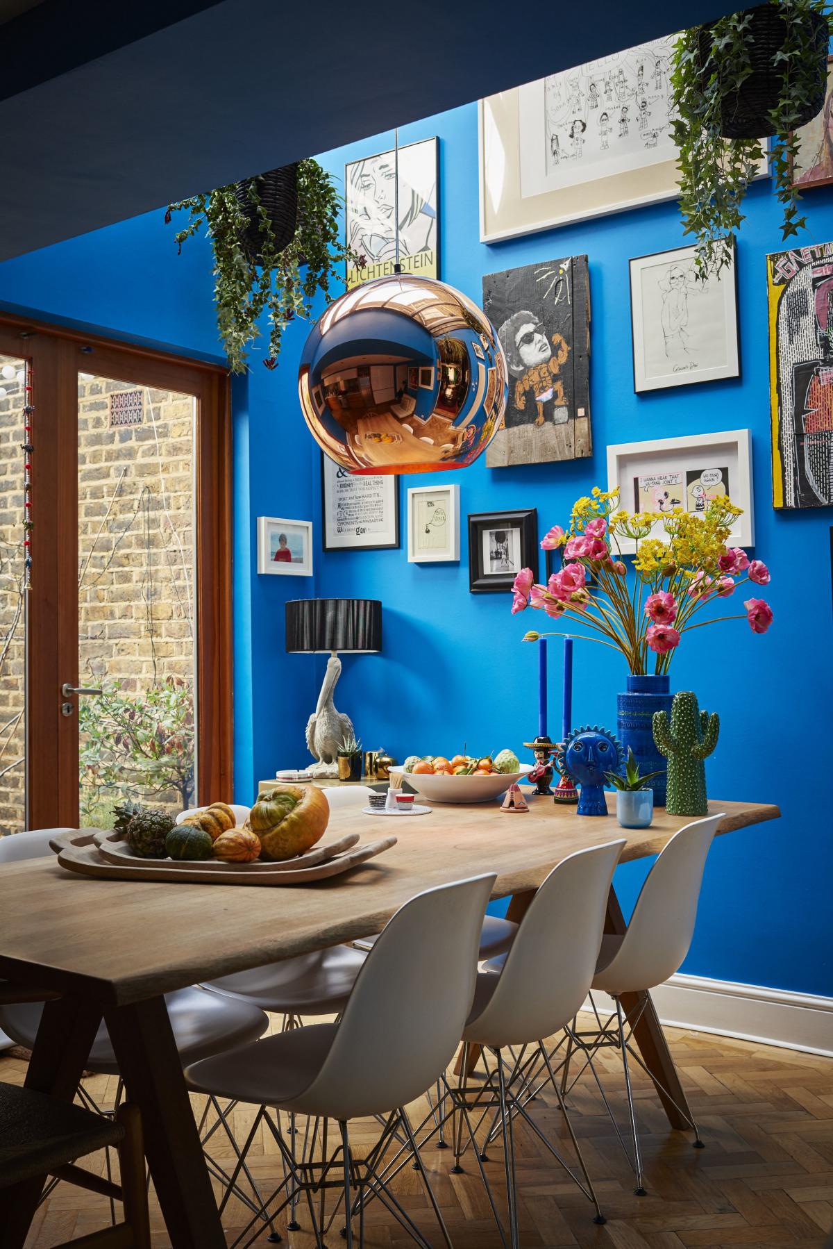
Wake up a wall...
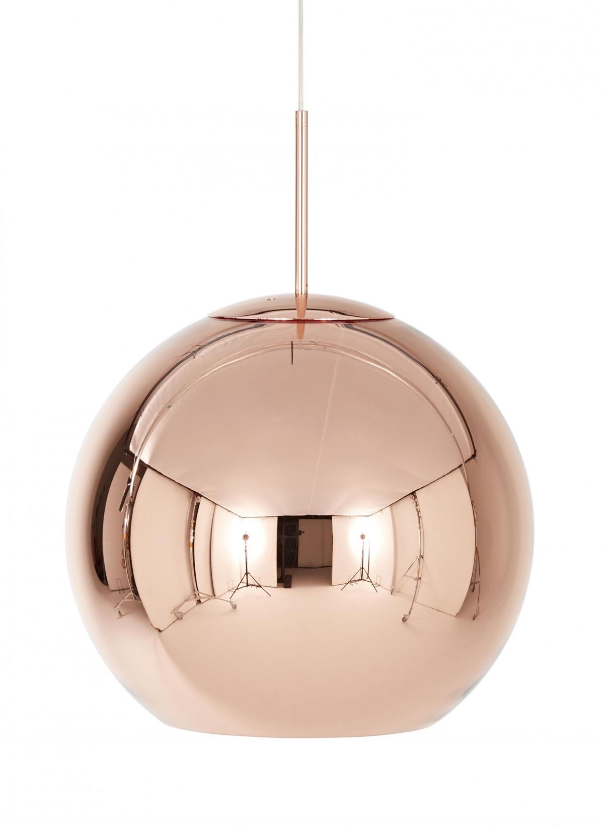
A vibrant blue shade on a wall brings shop owner Zoe Anderson’s dining area to life, with simple, modern furniture - including a gleaming Tom Dixon copper pendant light - to provide balance in the room.
“Kitchens are often painted in neutral colours as a safe option, but Zoe went all-out bold with an electric blue paint,” explains Henson.
“The walls are a vibrant backdrop for the family’s art collection, including children’s drawings and keepsakes collected on travels.”
EMILY’S DECOR TIP: Make a statement with a sofa or a chair in a daring or unusual shade, to show-off your adventurous colour spirit.
Bold doesn’t always have to mean bright, she points out, as paler shades can be just as effective. Think pink, sage green, or aquamarine - anything but the obvious.
nBe Bold: Interiors for the Brave of Heart by Emily Henson, photography by Catherine Gratwicke, is published by Ryland Peters & Small, priced £19.99. Available to readers for the special price of £14 (inc p&p) by going to rylandpeters.com and using code: BOLDPA at the checkout. Offer valid until December 31, 2018.


Comments: Our rules
We want our comments to be a lively and valuable part of our community - a place where readers can debate and engage with the most important local issues. The ability to comment on our stories is a privilege, not a right, however, and that privilege may be withdrawn if it is abused or misused.
Please report any comments that break our rules.
Read the rules here